About UCity
Where U8 exemplifies the positivity of roaring 1920s Berlin, its new sibling UCity is inspired by the desire to design a typeface for today’s cities and the challenges they face. The warmth and innocence of early modernist geometry are replaced by a colder, futuristic character with modern proportions, selected breaks in curves, and an undogmatic approach of geometry.
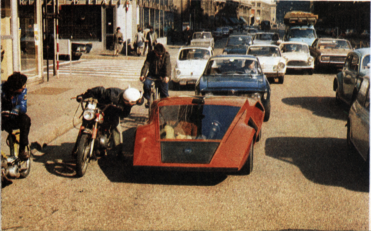
The Lancia Stratos Zero on a street in Italy and design illustrations, from Quattroruote March 1971.
In 2017, ten years after Anton moved to Berlin, the city had changed significantly. Its particular mix of history, clubs, squats and cheap rents had birthed an incredibly prolific alternative culture scene with the ‘arm aber sexy’ (poor but sexy) lifestyle attracting young artists and creatives from all over the world. After the financial crisis of 2008, real estate investors and startups saw opportunities for profit in the techno capital. While unemployment rates dropped rapidly (from 15% in 2007 to 9% in 2017), illustrious squats were evicted by the dozen and rents went through the roof, putting enormous pressure on precarious workers, including those of the ‘alt scene’. Easy-going artists were displaced by highly caffeinated office workers.
Looking to revisit his U8 typeface in a contemporary counterpart, Anton Koovit, son of a car racer, stumbled upon old photographs of the Lancia Stratos Zero. This extremely futuristic concept car, presented at the 1970 Turin Motor Show, was conceived by Marcello Gandini, head designer at Gruppo Bertone. The same year, Herb Lubalin and Tom Carnase released their ITC Avant Garde. The tightly spaced geometric sans, based on the logo of the eponymous magazine that Lubalin art-directed, was an instant favorite among graphic designers. It is no coincidence that UCity is partly inspired by design from the early 1970s, a period with striking parallels with today’s problems.
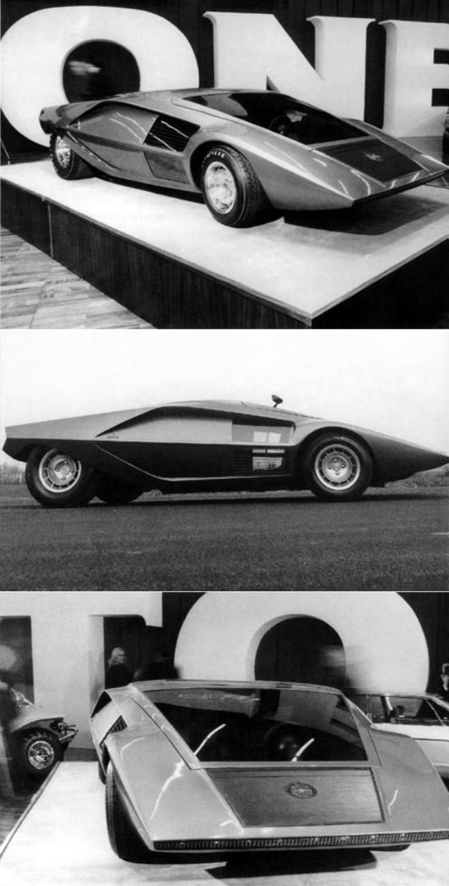
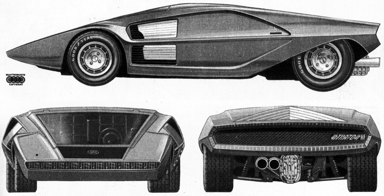
Lancia Stratos Zero presented at the Turin Motor Show, 1970.
The Apollo 11 mission to land humans on the moon marked the pinnacle of the Space Race and a new decade took off, charged with optimism about the opportunities that technical advancements would bring to people worldwide. Science fiction dreams of flying cars and household robots seemed to become a tangible reality. ARPANET, the forerunner of the Internet, was developed and soon microprocessors would make way to the advent of the personal computer. The supersonic Concorde, which would take jet setters and businessmen across the Atlantic in three hours, had just completed its first test flight.
One year before NASA landed on the moon, Stanley Kubrick’s 2001: A Space Odyssey hit the theaters. This strikingly modern masterpiece opens with titles set in all caps Gill Sans; Futura is used for chapters and credits. More than other styles, geometric type has come to represent the future and the universal, following modernist ideas of freeing design from any personal or cultural bias. Whether you believe this to be possible or not, there is no doubt that the typography of 2001 – like many of Kubrick’s formal choices – keeps the film looking current today, while many sci-fi films appear outdated shortly after their release.
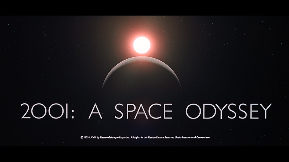
Opening title for 2001: A Space Odyssey by Stanley Kubrick, 1968. The typography is set in Gill Sans.
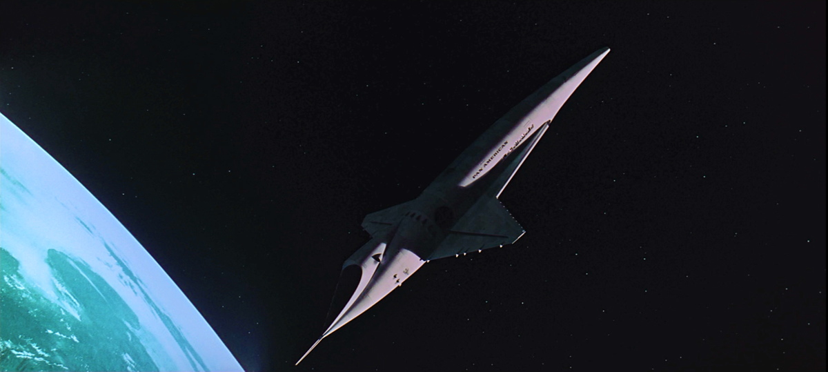
Bottom: Orion III space plane in 2001.
The same can be said about the Stratos Zero. In its minimalism and radical geometry based on the “wedge shape”, the car appears to be sketched after Gandini touched the monolith from Kubrick’s 2001. Marcello Gandini claimed an unprecedented free-spirited role for the industrial designer, imagining a car of the future with little care for marketing concerns, mass-production constraints or mainstream appeal. Fifty years later his work still looks incredibly more modern than the newest electric car on the street.
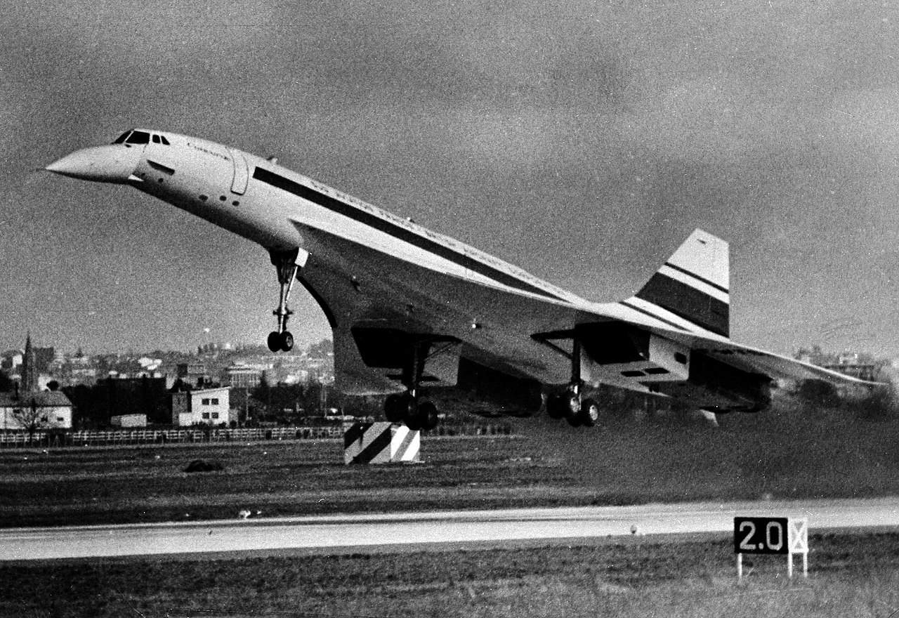
Concorde 001, first flight test in 1969.
The somewhat aggressive wedge-shaped silhouettes of Stratos and the supersonic Concorde jet are clearly reflected in UCity’s interrupted contours and sharp angles. But more than an exploration of high-tech, developing UCity offered an opportunity to revisit the strength of reduced geometric type design that was explored first in U8. Quirks and traces of handlettering in U8 were streamlined to achieve future-proof and graphic word images. Perpendicular and aligned terminals accentuate the typeface’s geometric nature. A softer, contemporary approach of geometry is visible in the construction of the curves of f, r and t. Letter spacing is slightly loosened up, enhancing legibility in small sizes.
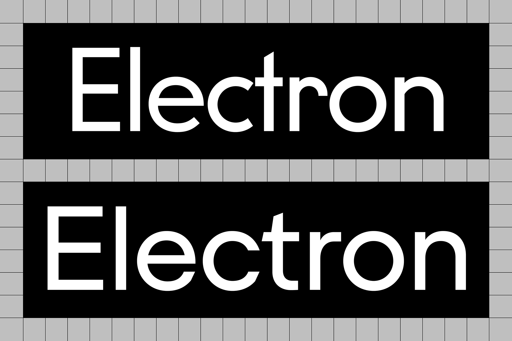
U8 (top) and UCity Pro (bottom).
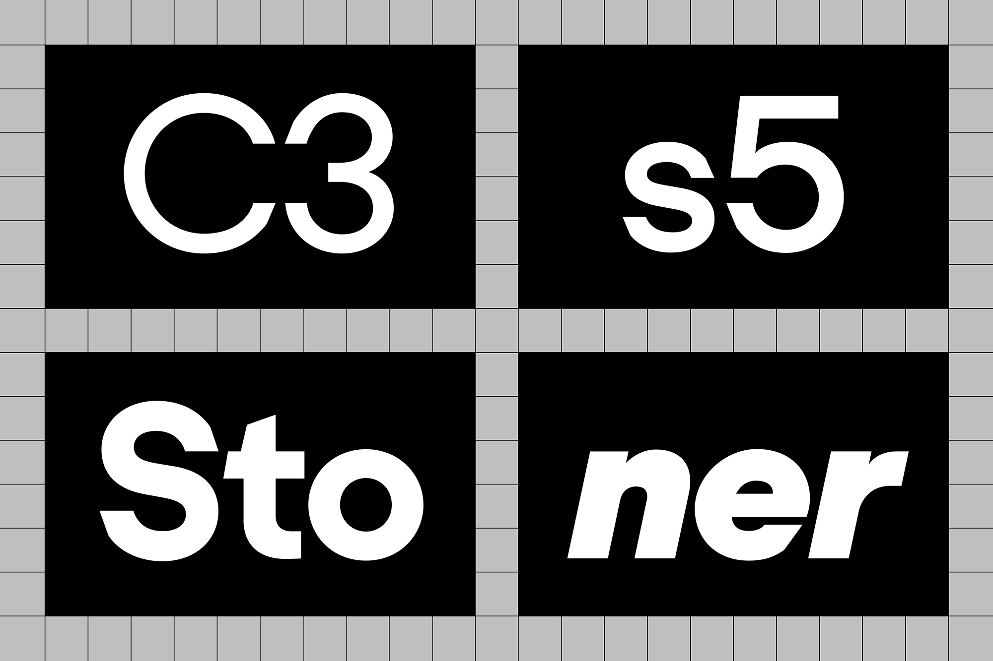
UCity Pro Regular, Semibold, Bold, Black Italic.
The 1973 oil crisis – a harsh and sudden wake-up call from Earth’s realities – halted the optimism of the early 1970s. The experience of a limited availability of natural resources had a tremendous impact on industry. The crisis also proved to be a boost for the burgeoning environmental movement. In 1970, the UN acknowledged the importance of a lasting relationship with our planet with the first Earth Day. Two years later, supported by a complex computer model from MIT, the Limits to Growth report stated that infinite growth on a finite planet is not possible. Today, after decades of activism and debate among scientists ecology has become a mainstream movement with significant political impact. More than ever before, the need for sustainability is abundantly clear.
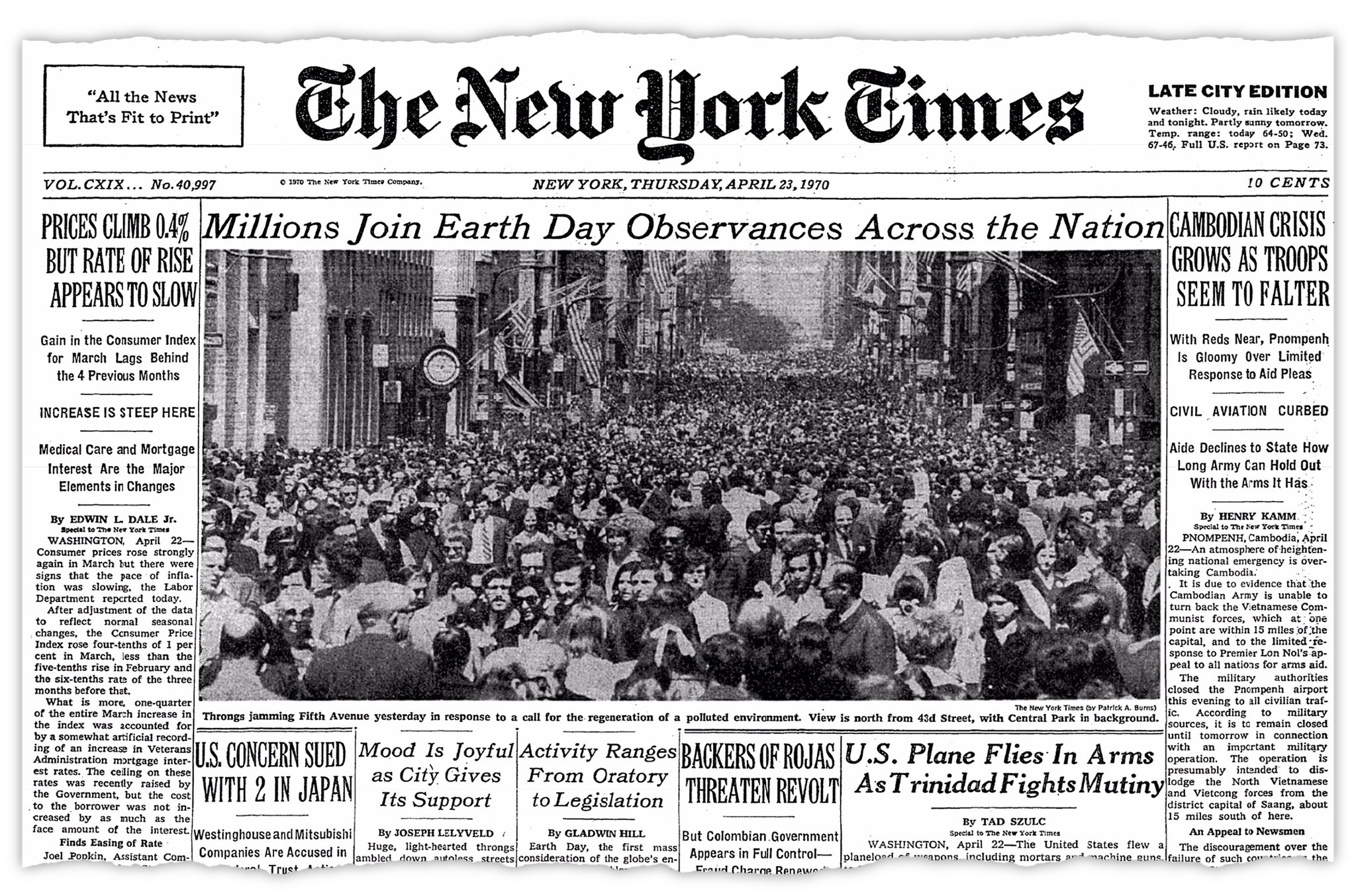
Top: New York Times cover the day after the successful first Earth Day, 23 April 1970.
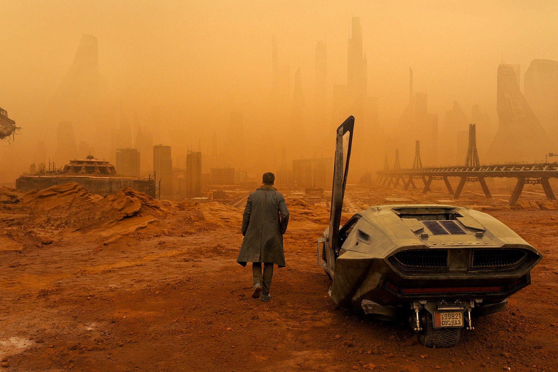
Bottom: Spinner in Blade Runner 2049.
In 2017, Blade Runner 2049 was released. Denis Villeneuve’s film features a wedge-shaped car reminiscent of Gandini’s prototype - but unlike the pure, modern Stratos, the science fiction Spinner is post-modern and dystopian. UCity’s design reflects on our time with the daring mindset of the early 1970s, hopeful that dystopian prophecies will be proven wrong with more sustainable cities coming about instead.
UCity Pro’s efficiency goes beyond formal qualities in its technical implementation: the entire family with Cyrillic support and OpenType features is available as a single variable font file, combining minimal data storage with maximum control of weight and italic angle. The challenges of today’s society leave little room for waste of energy. Fonts will not save the planet, but we believe UCity is a helpful tool for designers looking to build a better future.
Text: Fatype and Matthijs Sluiter